In 2026, the main hero of fashion and design is not a bright accent shade but a calm white. The Pantone Color of 2026, Cloud Dancer, is a soft, natural tone that feels like morning light filtered through clouds. It appears at a moment when the world is tired of visual noise and constant demands to be "brighter, faster, louder," and is increasingly valuing simplicity, clarity, and a sense of personal space.
The Pantone Color of 2026 is not about sterility. It's about a "clean page" you can start from: slowing life down, refreshing your wardrobe, your interior, and even your approach to visual style on social media. Cloud Dancer doesn't compete for attention. It highlights the person, the silhouette, and the details. That's exactly why it's already being described as a new form of quiet, minimalist luxury.
Pantone Color of 2026: The Historic White Cloud Dancer
The Pantone Color of 2026 is officially named PANTONE 11-4201 Cloud Dancer. It's a soft, airy white with a balanced mix of warm and cool undertones. This is the first time in the entire history of the Color of the Year program that white has been chosen as the main color. Since 1999, Pantone has mostly selected bright or deep shades that immediately catch the eye, from Viva Magenta to Peach Fuzz and Mocha Mousse. In 2026, the Pantone Color of the Year is almost invisible at first glance.
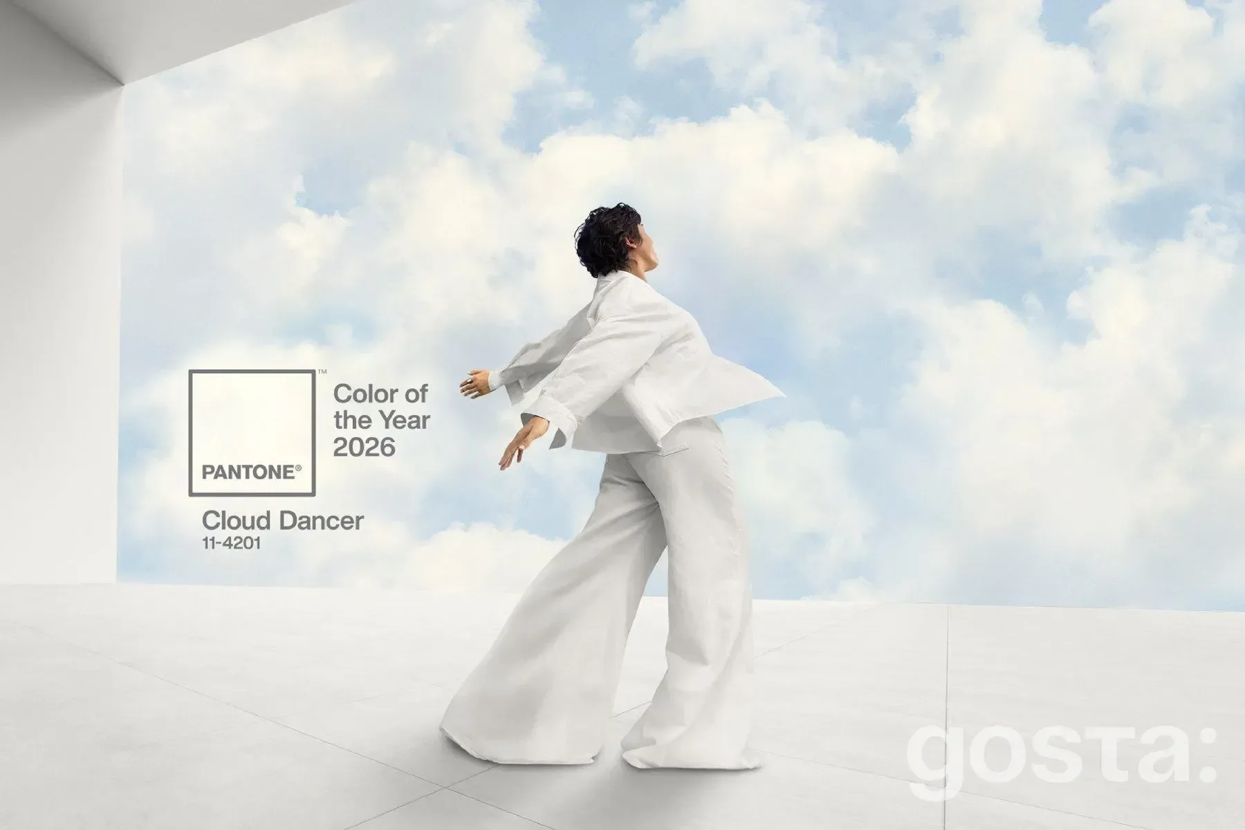
Pantone experts describe Cloud Dancer as "an elevated, airy white that feels like a breath of fresh air" and "a modest shade that brings clarity in a time of transition." The Pantone Color of 2026 reflects a calming influence in a society that is rediscovering the value of silence and inner dialogue. It's not a cold, laboratory-style white. It's a natural tone that doesn't push or shout. It creates a sense of space and lets you focus on what matters.
The Color of the Year program давно went beyond a professional designer palette. The Pantone Color of 2026 influences fashion, interiors, graphic design, the beauty industry, and branding. For many brands, it becomes a signal of where to move collections, how to rethink visual identity, and which shades to highlight in campaigns. In this sense, Cloud Dancer is a very convenient "structural" color: it works with any palette, doesn't impose a mood, yet still creates a clear emotional background.
Pantone emphasizes that the Pantone Color of 2026 is not just another trendy catalog code but a response to the visible fatigue from visual and emotional noise. At a time when feeds and shop windows fight for attention, stepping away from too much color looks more radical than releasing another pink or blue hit. Cloud Dancer shifts the focus from color as a "firework" to the person, the silhouette, and the meaning.
How Pantone Chooses the Color of 2026 and What It Says About the Era
Every year, the Pantone Color Institute team studies the global context: moods in art, fashion, design, social media, pop culture, technology, and even politics. The Pantone Color of 2026 is the result of long analysis, not a simple "like or dislike." Experts look at which palettes appear on runways, in furniture collections, digital products, and branding, how visual communication is changing, and what people are missing in an oversaturated space.
In the case of Cloud Dancer, the starting point was clear fatigue from constant stimulation. After warm, "hug-like" tones such as Peach Fuzz (2024) and Mocha Mousse (2025), the Pantone Color of 2026 takes another step toward simplicity. Instead of complex blends, it offers a pure white that works like a pause between information explosions. A world living in constant anxiety and overload gets a signal: the right to rest and clarity can also be a fashion message.
When choosing the Pantone Color of 2026, the team considers:
- Global cultural and social moods.
- Long-term trends in fashion, interior design, and technology.
- Visual patterns in media, film, advertising, and social networks.
- The psychological state of society and the level of "noise fatigue."
- The demand for certain emotions: calm, energy, nostalgia, optimism.
After analyzing all these layers, Pantone draws a conclusion: the Pantone Color of 2026 should be a tool that helps people rethink their visual environment, not just add "another trendy shade" to their feed. In this sense, Cloud Dancer works like a visual detox: a base you can build on without losing balance.
The Symbolism of Cloud Dancer: Calm, a "Clean Page," and Less Noise
Pantone describes Cloud Dancer as a shade that "moves between light and airiness, creating a living calm that invites renewal and focus." The Pantone Color of 2026 literally removes the excess. A white background lets the eye rest not on bright spots but on shape, proportion, and texture. Psychologically, it feels like an invitation to pause and finally hear yourself.
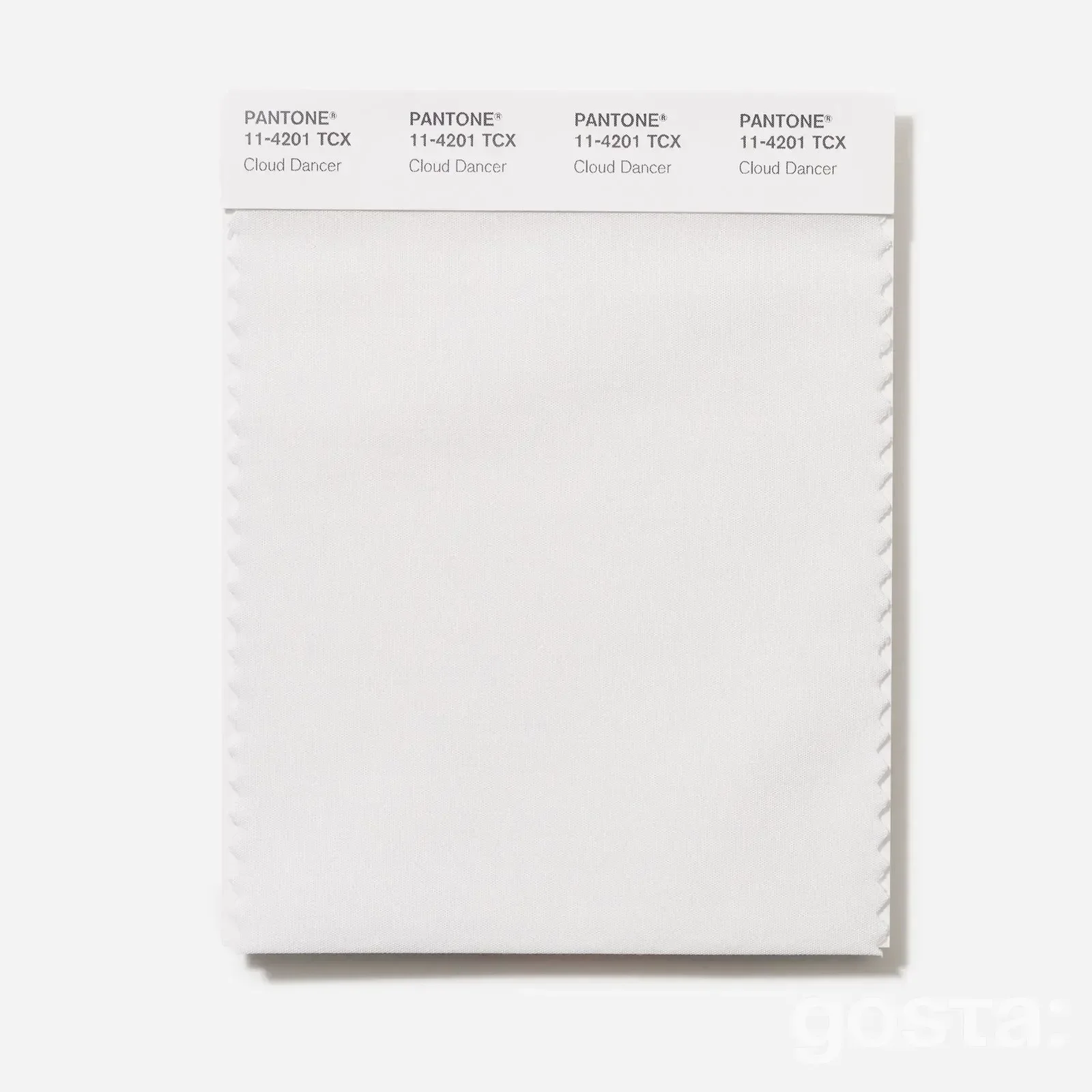
Cloud Dancer has no association with hospital sterility. Pantone stresses that it's a "natural white" with a soft balance of warm and cool notes, perceived as human rather than technical. The Pantone Color of 2026 feels closer to morning light diffused through clouds than to a sharp office lamp glare. It reduces tension without making spaces feel impersonal. On the contrary, it highlights human presence.
The meanings behind the Pantone Color of 2026 Cloud Dancer include:
- Calm and inner focus instead of visual hysteria.
- Reset and a new start, a "clean page" for ideas.
- Transparency, honesty, and letting go of excessive decoration.
- Harmony, balance, and community over competing for loudness.
- Content over packaging, when the background steps back and meaning comes forward.
In wardrobes, interiors, and digital visuals, the Pantone Color of 2026 reinforces all these ideas. Cloud Dancer doesn't steal attention. It creates space for personality, story, and objects. That's its main difference from past trend shades that often worked as instant visual hooks.
Pantone Color of 2026 on the Runways: From Light Dresses to Voluminous Puffer Coats
As soon as Pantone announced that the Pantone Color of 2026 would be Cloud Dancer, fashion reviews started showing runway looks from Dior, Jil Sander, Alexander McQueen, Vaquera, and other brands. White was already there: in weightless dresses, oversized coats, and suits made from soft yet structured fabrics. Designers use this shade not as an "empty canvas" but as a tool that emphasizes the power of silhouette and texture.
In Spring–Summer 2026 collections, the Pantone Color of 2026 often appears in total looks, from sneakers to minimalist trench coats in the same tone. This approach shows that white can be a full foundation of an outfit, not just a mood shirt or T-shirt. A light chiffon dress in Cloud Dancer feels fluid and airy, while dense cotton or wool makes the same shade look more graphic and almost architectural.
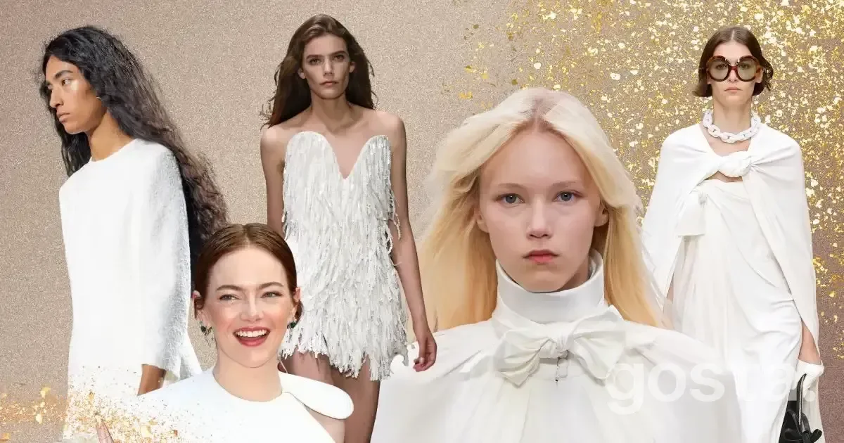
Brands also play with contrasts. The Pantone Color of 2026 is paired with black, deep chocolate, navy, and green shades, not to turn white into a secondary background but to make those colors sound clearer. Cloud Dancer stays at the center of the composition. In shoes and accessories, from white sneakers to oversized bags, it adds a sense of quiet luxury without obvious shine.
The Pantone Color of 2026 already feels like a practical bridge between minimalism and the desire to stand out through details. Instead of buying another loud piece that gets boring after one season, brands suggest investing in Cloud Dancer items that will easily last through several years of trends.
How to Wear the Pantone Color of 2026 in Everyday Style
The main advantage of Cloud Dancer is that it doesn't require a full wardrobe reset. The Pantone Color of 2026 is already present in most people's basics: white shirts, T-shirts, sneakers, sweaters. The difference is how you use them: as a default background or as a thoughtful style tool.
For the Pantone Color of 2026 to really work, pay attention to three things: fabric texture, silhouette, and contrast. A chunky knit sweater, soft cotton shorts, a silk blouse, or a matte wool suit in Cloud Dancer all look different, even though the shade code is the same. Skin tone also matters. This natural white is usually softer than optical white, so it doesn't wash out the face and fits more easily into daytime looks.
How to Style the Pantone Color of 2026 Across Different Looks
Each option shows the Pantone Color of 2026 not as "empty white" but as a base for real-life scenarios: office work, city weekends, travel, evening meetings. Don't be afraid of monochrome. A "white top, white bottom" look works when you play with textures and shapes.
In practice, care matters. White is always sensitive to stains, but the Pantone Color of 2026 also looks good when it's not perfectly crisp. Slightly softer, lived-in fabrics fit the idea of Cloud Dancer well. The overall trend toward naturalness supports this: a bit of real life in your clothes doesn't contradict the concept, it reinforces it.
Pantone Color of 2026 in Accessories, Beauty, and Interiors
Not everyone feels comfortable wearing a full white look, and that's completely fine. The Pantone Color of 2026 works great in small doses: shoes, bags, belts, jewelry, manicures. White sneakers or a Cloud Dancer bag add freshness. Glasses frames, watches, rings, or earrings in soft milky white look modern without visual overload.
In beauty, the Pantone Color of 2026 shows up in the trend for "clean" manicures: milky white nails, subtle graphic accents, light highlighters. Cloud Dancer is used as a base for minimalist nail art, restrained eye makeup, and light hair accents. The logic is the same: the shade doesn't steal attention but highlights natural features.
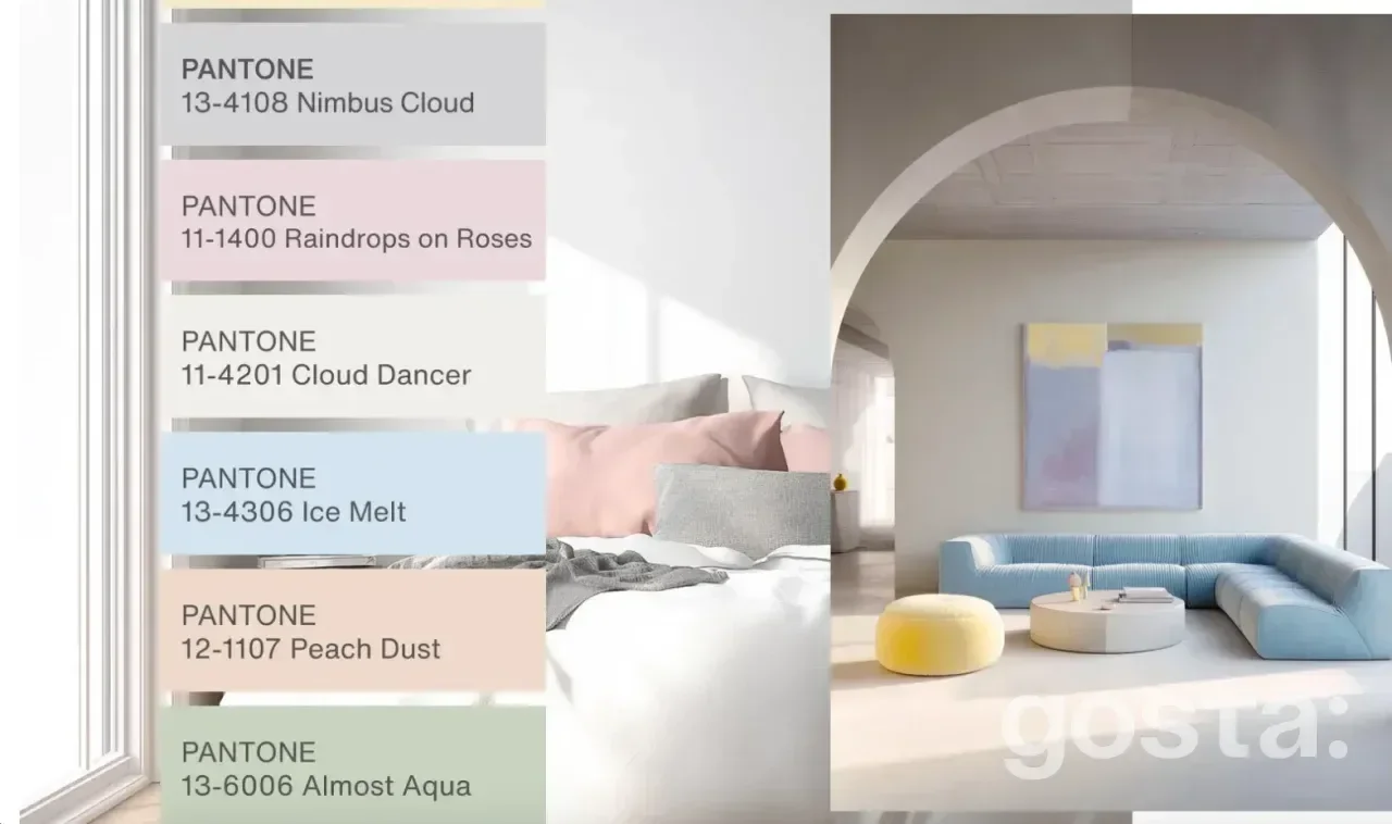
In interiors, the Pantone Color of 2026 is already being called a key choice for kitchens, living rooms, and bathrooms. Cloud Dancer appears on walls, furniture, ceramics, and appliances, from faucets to coffee machines. In kitchens, it visually expands space without feeling office-like, thanks to its warm base. Designers recommend pairing Cloud Dancer with natural stone, warm wood, and textured tiles to add depth.
In digital environments, the Pantone Color of 2026 feels like a response to tired eyes. Brands test light, breathable interfaces focused on readability. Social media designers add more air to slides and carousels. A Cloud Dancer background lets typography, photos, and content stand out without forcing viewers to push through layers of decoration.
Why the Pantone Color of 2026 Is More Than Just Another Trend
In comments after the announcement, some people joked, "Seriously, the Pantone Color of 2026 is just white?" But behind that simplicity is a very clear sense of the era. After years of loud competition, the demand has shifted. People want to understand what really matters, filter out the excess, and keep what's essential. The Pantone Color of 2026 speaks exactly to that need.
Cloud Dancer is convenient for brands, designers, and stylists, but its value goes beyond easy matching. The Pantone Color of 2026 sets a new "language of respect for the viewer": less visual aggression, more space, more attention to people rather than effects. When a white background becomes the main character, the way we consume information, dress, and design our homes and digital projects changes.
For us as consumers, it's a signal that we don't need to chase every new seasonal shade. It's enough to revisit the basics: a shirt, a T-shirt, a sweater, a coat, sneakers, a few interior items, and see how the Pantone Color of 2026 can support what you already have. In this approach, Cloud Dancer truly becomes more than just a color of the year. It turns into a tool for making the world around us a bit calmer and more honest to our eyes and nervous system.
Frequently Asked Questions About the Pantone Color of 2026 Cloud Dancer
Does the Pantone Color of 2026 Mean Everything Should Be White?
No. Cloud Dancer is a key foundation, not an order to strip all color from your wardrobe or home. It works as a base that makes it easier to build your own palette.
How Is the Pantone Color of 2026 Different From Regular White?
Cloud Dancer has balanced warm and cool undertones, so it looks softer than optical "paper" white and works better in clothing, interiors, and digital design.
How Can I Wear the Pantone Color of 2026 If I'm Afraid of Total White Looks?
Start with accents: a white shirt, sneakers, a bag, a belt, earrings. This lets you test Cloud Dancer in a safe way and add more pieces if it feels right.
Is the Pantone Color of 2026 Practical for Everyday Life?
Yes, if you choose quality fabrics and think about care. White always needs more attention, but Cloud Dancer pieces are easy to mix, so they rarely sit unused.
Why Should I Care About the Pantone Color of 2026 If I Don't Work in Fashion or Design?
This shade will quickly appear in clothing stores, tech products, home items, social media, and advertising. Understanding what the Pantone Color of 2026 stands for helps you make more conscious choices and reduce visual noise, choosing what truly fits your pace of life instead of just another trend.